Salume.
Complete identity for a NYC restaurant
Client: Salume NYC
Scope: Identity & environment
Overview
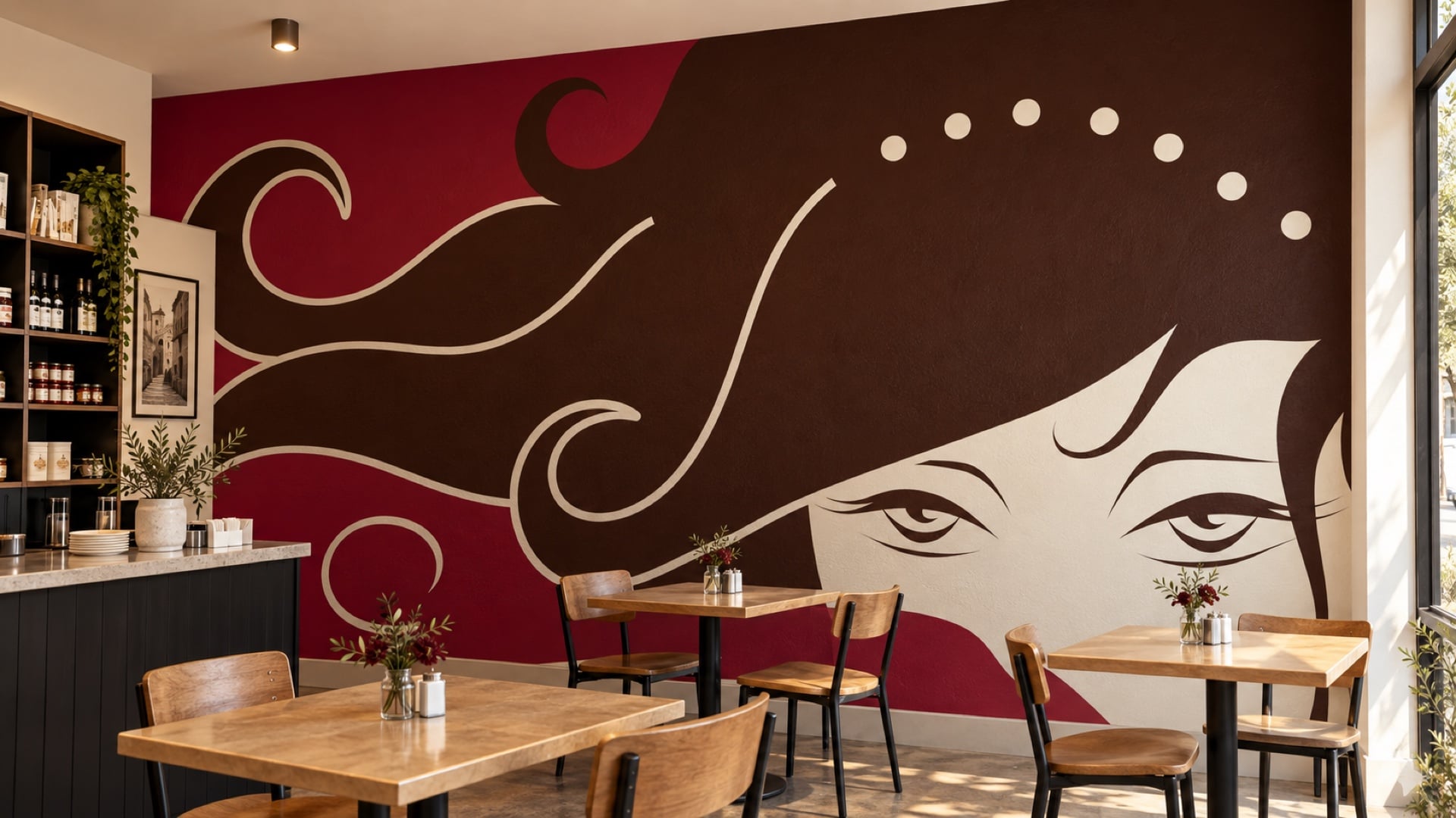
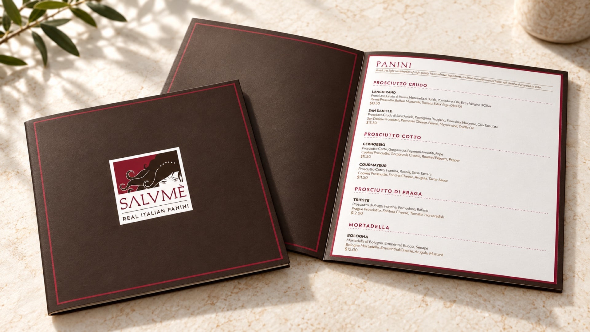
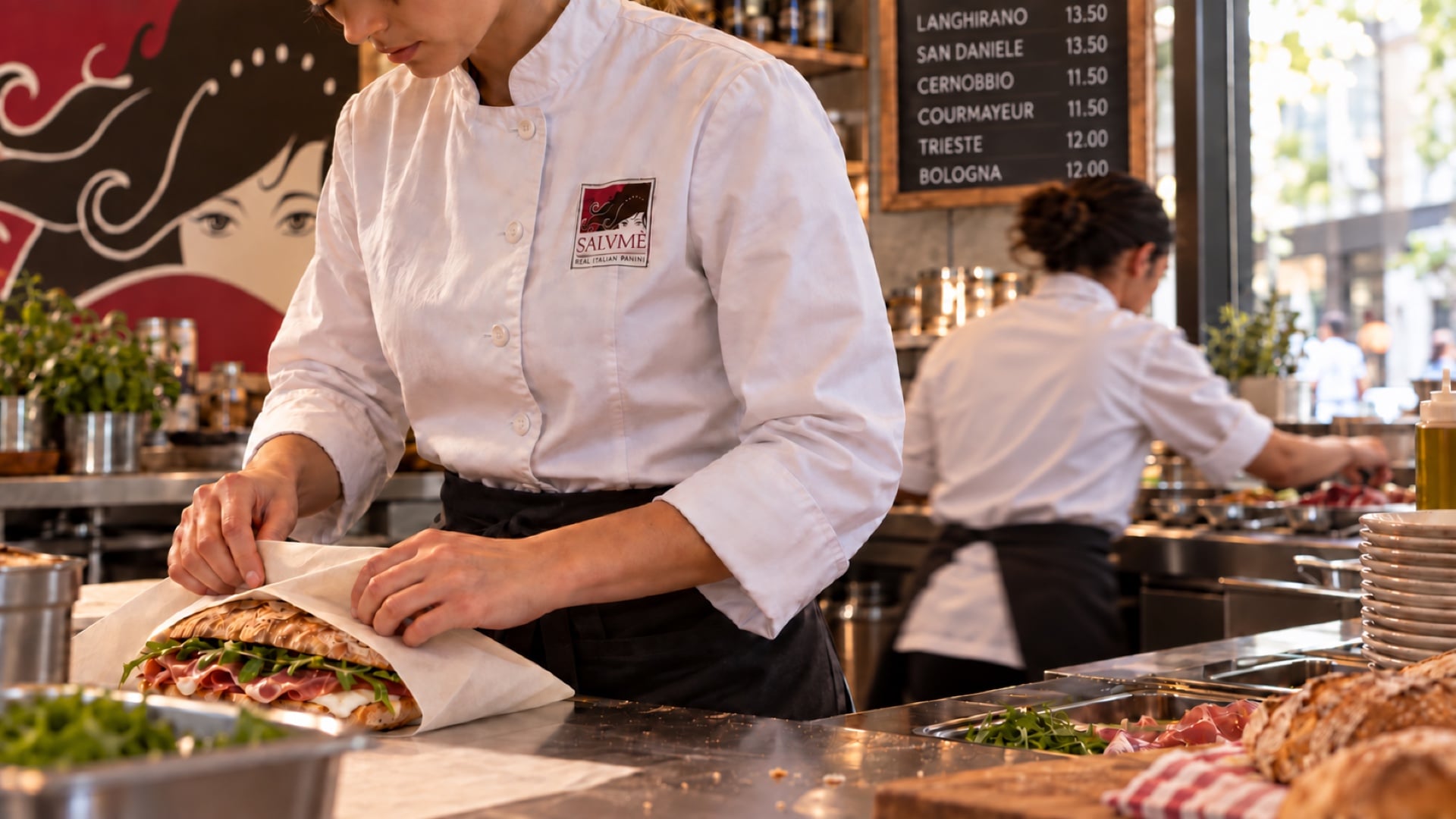
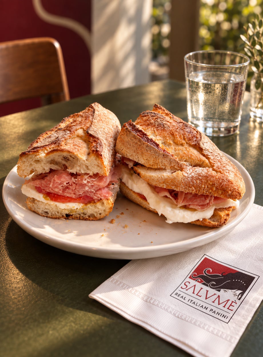
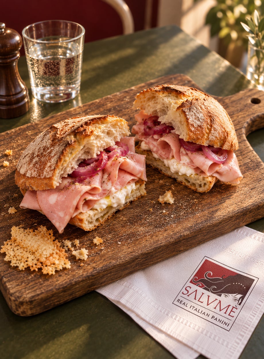
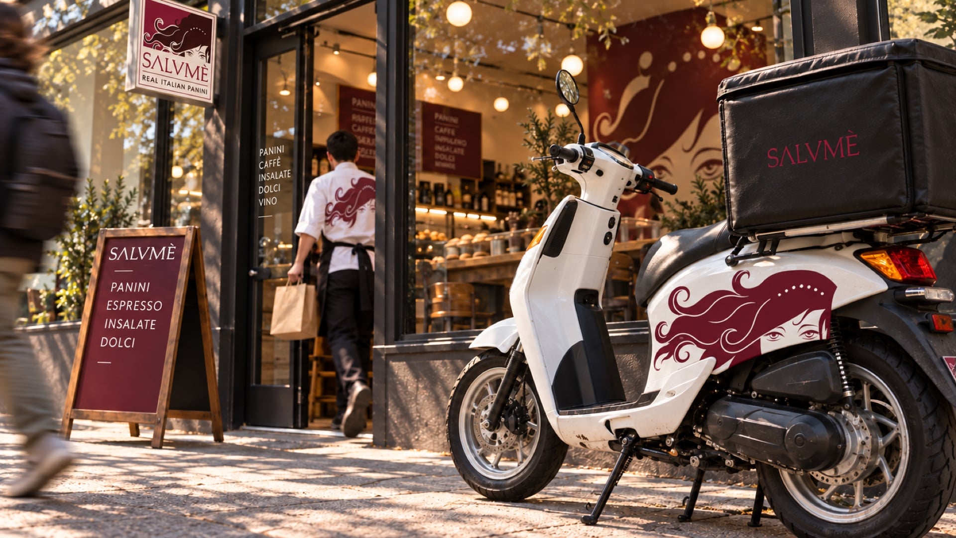
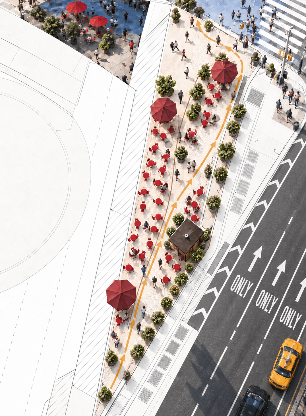
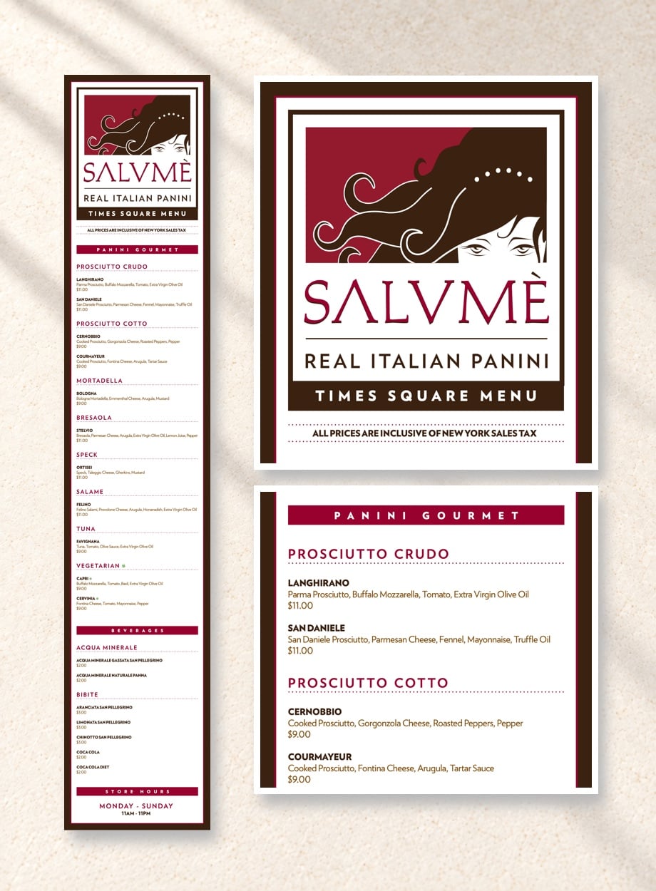
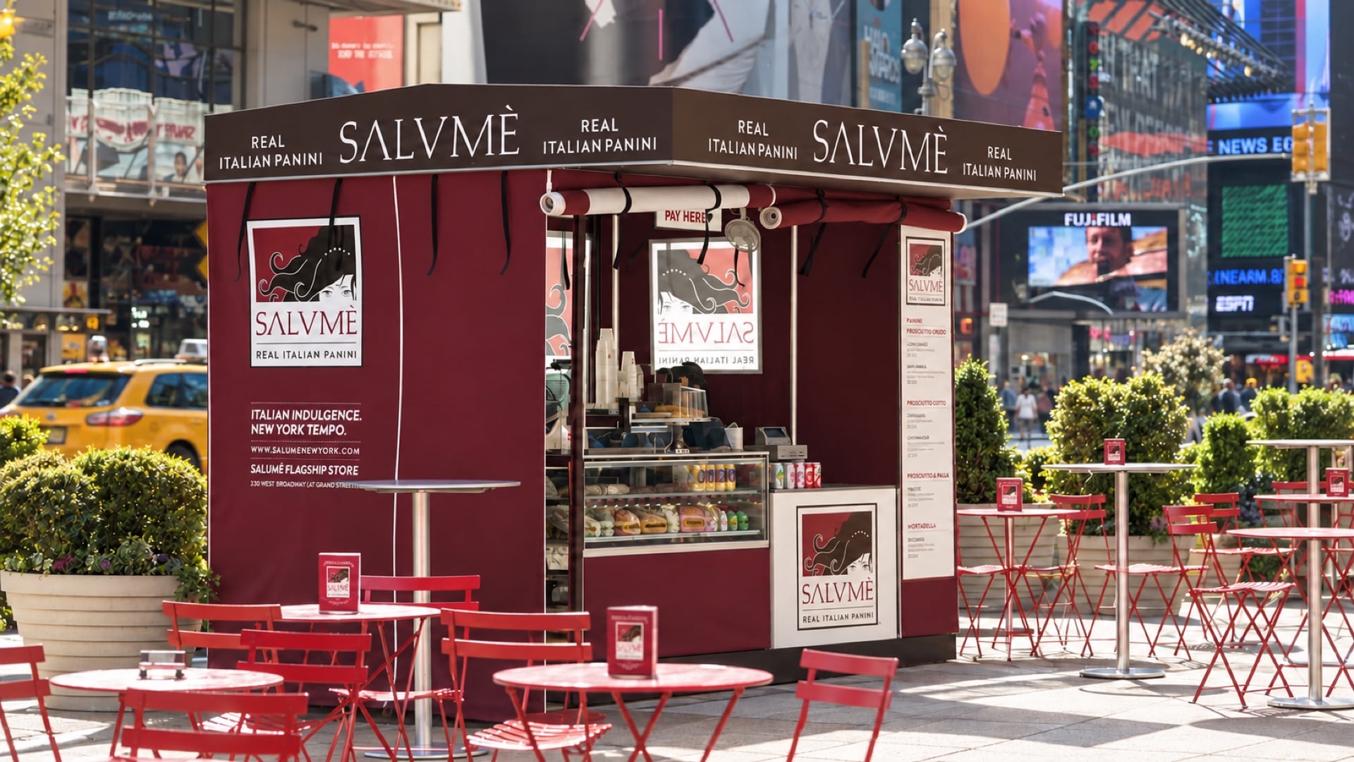
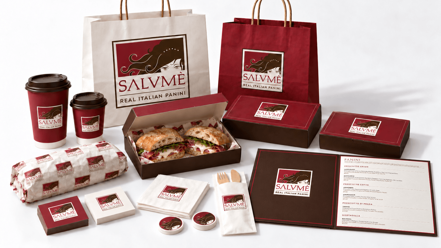
Salumè’s owner wanted to bring New York the panini of an Italian salumeria, tall and never pressed. In the name, he heard Salome, the biblical seductress, and the logo grew from there. So we let her set the tone for everything else. Every sign, box, bag and uniform, down to the delivery bike, was designed to make you hungry. Then we took the temptation to Times Square, working with the city and the architects on a kiosk laid out to catch the crowd and lead it back to the restaurant. It worked on New York Magazine too, which named it the city’s best sandwich in its first year. Like Salome, it leaves people wanting more.
“
An erstwhile adman waging a one-man campaign against a popular misconception... a shop so single-mindedly dedicated to what he considers his birthright—Real Italian Panini—that he emblazoned the phrase across the front door.
Build it on purpose.
Book a Call →